
Adidas 302
Adidas 302
Adidas was launching a series of football boots for the season. However there were no systems in place and through service experience there needed to be a process where the brand had design functionality that reduces cost and expanded output. A system that would accommodate the global launch.
Adidas was launching a series of football boots for the season. However there were no systems in place and through service experience there needed to be a process where the brand had design functionality that reduces cost and expanded output. A system that would accommodate the global launch.

UX Process
UX Process
The initial research was to understand what was required, the primary flow for customers and to understand the competition. Once the elements required were agreed I used a various methods such as a card selection method to obtain the importance of each module and where it should be placed in the hierarchy. Understandably the product image and the buy product were the top two and a flow diagram was created to confirm the layout. Surprisingly Messi who is used to being at the top was pushed lower down the stack.
The initial research was to understand what was required, the primary flow for customers and to understand the competition. Once the elements required were agreed I used a various methods such as a card selection method to obtain the importance of each module and where it should be placed in the hierarchy. Understandably the product image and the buy product were the top two and a flow diagram was created to confirm the layout. Surprisingly Messi who is used to being at the top was pushed lower down the stack.

Other research was done later on with the ability to adequately buy the product and view its unique features. This was done by a small user group each given a specific task.The results pushed the buy button onto the hero image making the possibility of purchase even quicker than before. It also certified that more key images should be shown on the cover of each module rather than being on a secondary page. The processes were vital to confirming decisions already made and steered new ones making the UX much more accessible and efficient to the user.
Other research was done later on with the ability to adequately buy the product and view its unique features. This was done by a small user group each given a specific task.The results pushed the buy button onto the hero image making the possibility of purchase even quicker than before. It also certified that more key images should be shown on the cover of each module rather than being on a secondary page. The processes were vital to confirming decisions already made and steered new ones making the UX much more accessible and efficient to the user.
Other research was done later on with the ability to adequately buy the product and view its unique features. This was done by a small user group each given a specific task.The results pushed the buy button onto the hero image making the possibility of purchase even quicker than before. It also certified that more key images should be shown on the cover of each module rather than being on a secondary page. The processes were vital to confirming decisions already made and steered new ones making the UX much more accessible and efficient to the user.
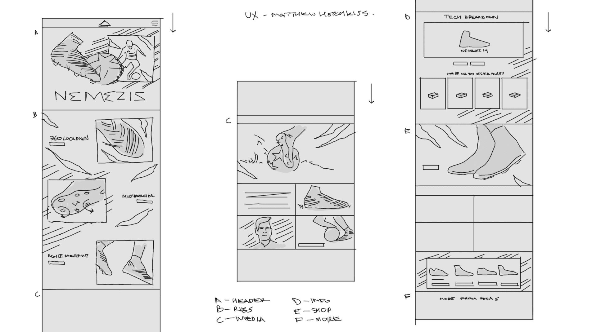
Creating the best user experience was to know what the customer wanted. From the research it was to show the product at its best and to make a purchase quickly. The results had already moved the purchase ability from section 5 to section 2. Now it was time to design a wireframe, create a low fidelity prototype , show internally the progress and experience the flow on multiple devices.
After using a Figma template for the userflow I decided to continue in Figma for the wireframe. As I had to create 4 different sites I decided to see if I could create a design system for the brief so we could repurpose all the elements across the 4 different products saving a huge amount of design and development time by only changing the CSS and backend links. To start this process the UX elements had to be modules that had key elements that could be swapped while keeping the structure the same.

Workshops
Workshops
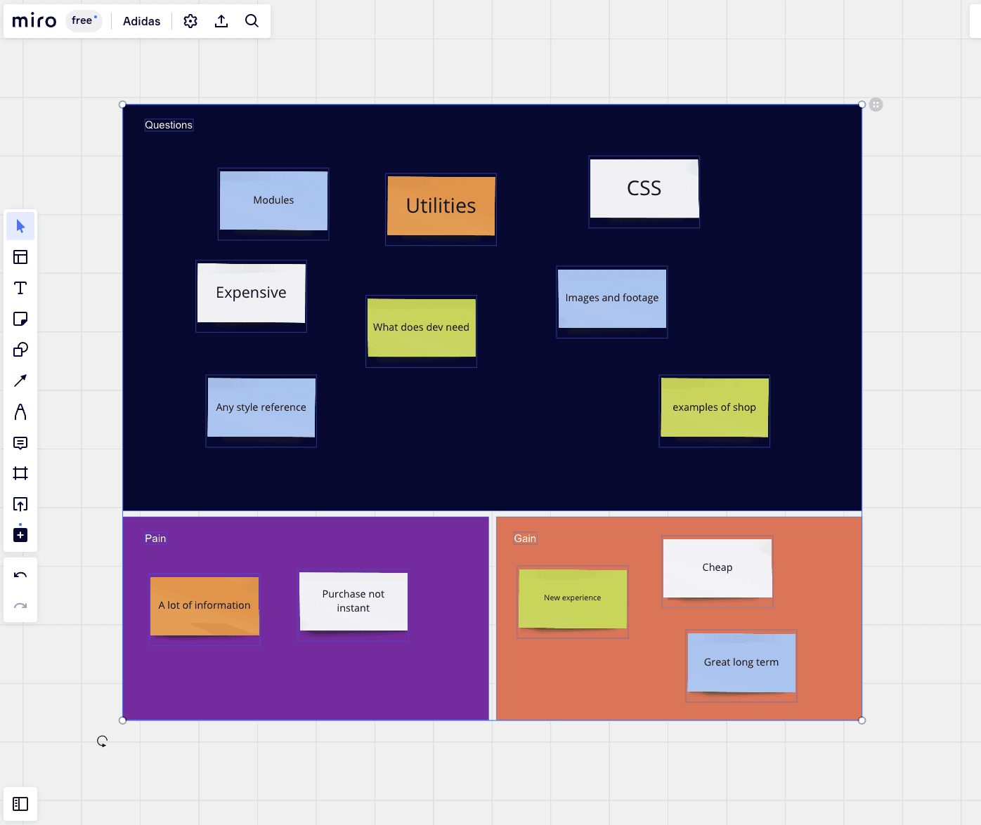
As this was an agile pipeline where the product owner speaked for the majority of the customers I needed to present him and the heads of design and development the progress. With the sprints being two weeks I had the opportunity to show the lowfi prototypes, while conducting a zoom call. We also did a miro empathy session on digital whiteboard where my questions were answered and pain points mentioned. There were no huge setbacks in design or development so engineers could start blocking the 5 sections and I could carry on with the UI and design system.
As this was an agile pipeline where the product owner speaked for the majority of the customers I needed to present him and the heads of design and development the progress. With the sprints being two weeks I had the opportunity to show the lowfi prototypes, while conducting a zoom call. We also did a miro empathy session on digital whiteboard where my questions were answered and pain points mentioned. There were no huge setbacks in design or development so engineers could start blocking the 5 sections and I could carry on with the UI and design system.
UI Designs
UI Designs
The design team had created a style for print already so it was my duty to take what was made and create for digital converting assets to the appropriate file type, resizing and creating elements where necessary. Working with the development team closely there were elements that were repurposed in size and format that made the designs more inline with what was already available in the code. Setting up the correct formats of layout for the devices was also expected and using Googles Material DSM guide I used 12 column for desktop, 8 for tablet and 4 for phone setting up a base of a 4 system. For aspect ratio sizing I went for a smaller size than required which helps with any issues when reaching a breakpoint. 320, 768, 1440 are the sizes that I work to unless requested otherwise. Fonts and colours were set but I did have to setup a small DSM of font styles and components. I used a 16pt as a base as it is kind for usability (WCAG)
Product testing was done regularly with the development team and elements were adjusted, code discussed and tweaked to make the product work extremely well. Layering images over animations was a little pain point and to simplify away from bugs we merged it all into a loop-able .png sequence then converted to lottie. Adjusting to the other 3 products was straight forward after the initial one was created as all sizing and asset styles matched.
The design team had created a style for print already so it was my duty to take what was made and create for digital converting assets to the appropriate file type, resizing and creating elements where necessary. Working with the development team closely there were elements that were repurposed in size and format that made the designs more inline with what was already available in the code. Setting up the correct formats of layout for the devices was also expected and using Googles Material DSM guide I used 12 column for desktop, 8 for tablet and 4 for phone setting up a base of 4 system. For aspect ratio sizing I went for a smaller size than required which helps with any issues when reaching a breakpoint. 320, 768, 1440 are the sizes that I work to unless requested otherwise. Fonts and colours were set but I did have to setup a small DSM of font styles and components. I used a 16pt as a base as it is kind for usability (WCAG)
Product testing was done regularly with the development team and elements were adjusted, code discussed and tweaked to make the product work extremely well. Layering images over animations was a little pain point and to simplify away from bugs we merged it all into a loop-able .png sequence then converted to lottie. Adjusting to the other 3 products was straight forward after the initial one was created as all sizing and asset styles matched.

From more sprints and collaboration we decided to make the purchase of the product even more efficient by including a shop button on the hero image on module 1. That gave the user instant access to the primary flow if required. Also related items were added to the bottom of the page so if the customer arrived at a different location the item links were always available.
Another area on the Adidas site was created to clearly change product selection as well as multiple banner ads were scattered on the site and other third party sites to draw attention to the campaign.

Retrospective
Retrospective
Challenges
Setting up research internally and introducing collaborative thinking. In the creative space ideas are filtered down by waterfall so allowing more people to input was tricky to influence initially.
Wins
Generally people felt more happy that it was a team effort which made the product better. To create a system that made so many assets was humbling.
Take aways
It was enjoyable to see all the assets go live, that the system had been updated and rolled out for the three other boots.
Credits
Credits
Client - Adidas
Agency - Fitch
Client - Adidas
Agency - Fitch